Motion Graphics - Privacy Breach & Secure Cloud Storage

Visualizing the Risks of Unencrypted Data
Overview
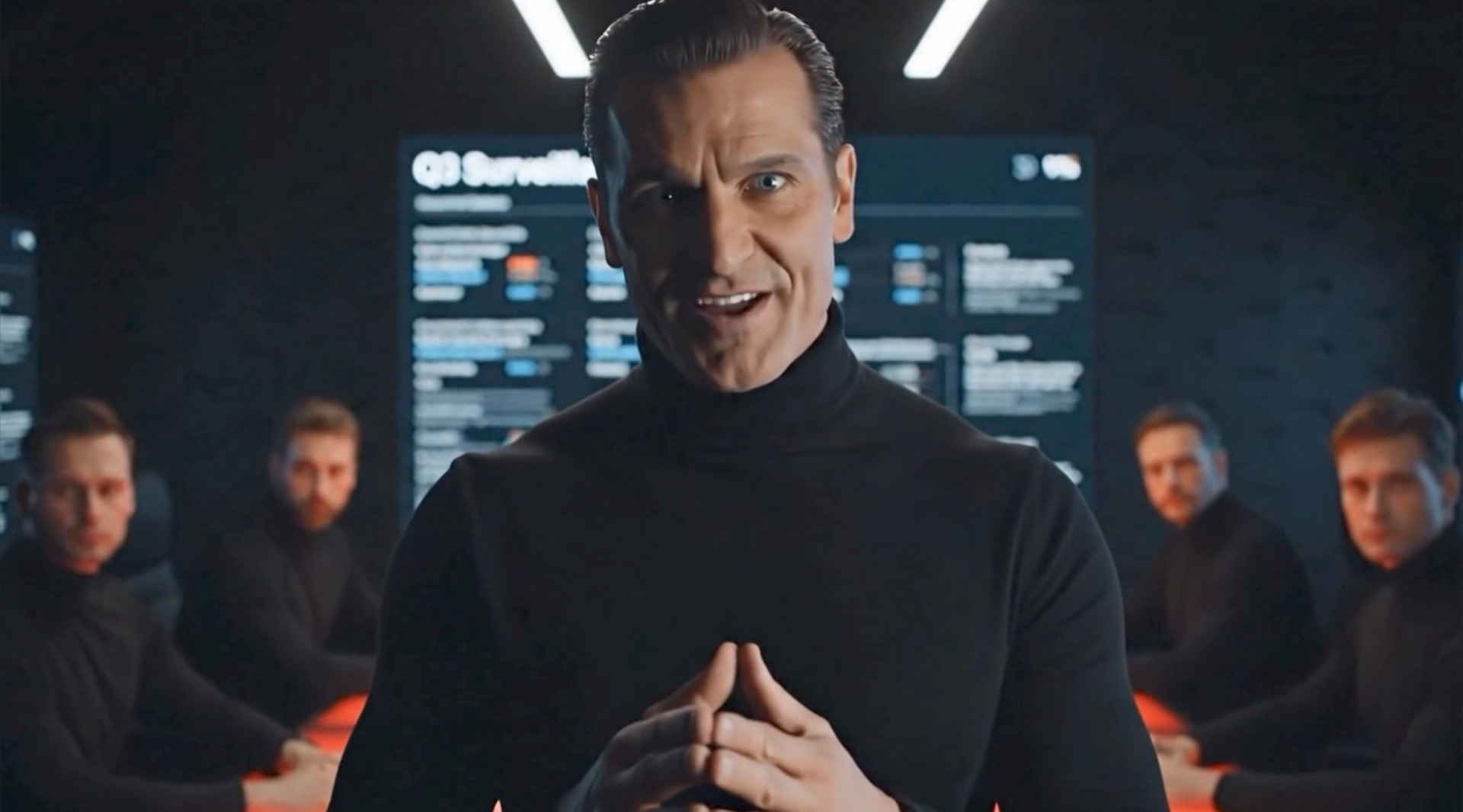
This project was part of an AI-driven awareness campaign for Sync.com, a secure cloud storage platform. The video presents a fictional “evil agency” exploiting unencrypted data for profit—illustrating how competitors mishandle user information, while Sync.com protects it with end-to-end encryption.
My role:
- Create animated sequences visualizing the statistics.
- Adapt the entire project from horizontal format to vertical format for social media.
- Produce a comparison video (Sync.com vs. Competitors) that highlights the difference in upload security.
Design Process
1. Storyboarding the Script
The script set the tone with its satirical, corporate-villain delivery:
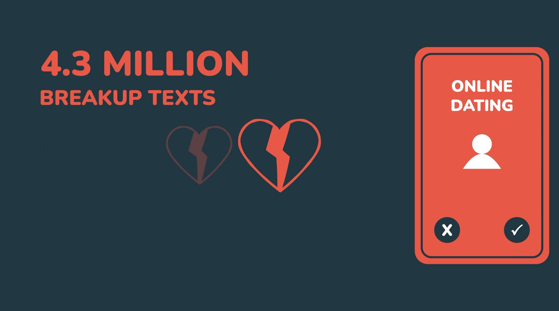
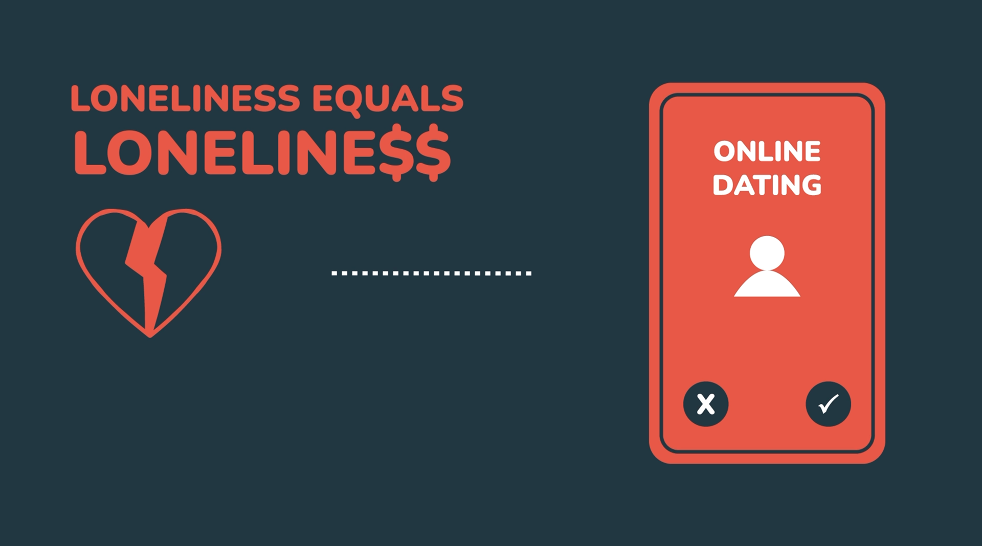
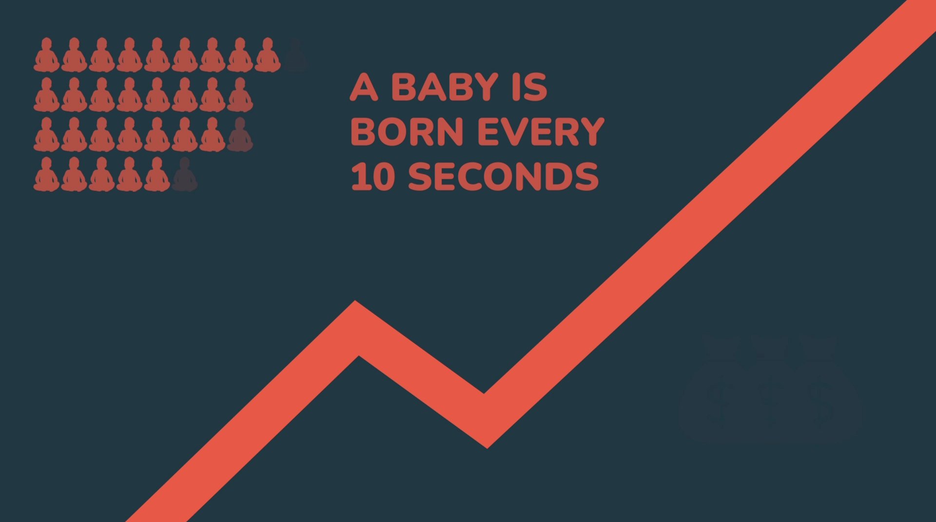
“Because their data uploaded isn’t encrypted, we can see their files. This quarter, we surveyed 40 million customers, predicted 4.3 million breakups and monetized 12 million family photos. Let me show you in detail…”
At this point, the video transitions into animations. Each visual had to make the statistics feel cold, transactional, and sinister, reinforcing the concept that human lives were reduced to profit pipelines.
2. Concept Development
There are two simple things to have:
- Goal: Translate abstract statistics into visual metaphors that feel mechanical, unsettling, and data-driven.
- Direction: Keep designs minimalist but loaded with symbolism—fractures for divorces, coffins for deaths, and rhythmic icons for babies.
3. Asset Creation
A library of icons, shapes, and typography treatments was developed to maintain clarity and consistency.
- Clean, geometric forms for universal readability.
- Custom icons to represent life events (broken heart, fading figure, baby outline).
- Text styles optimized for both presentation screens and mobile viewing.

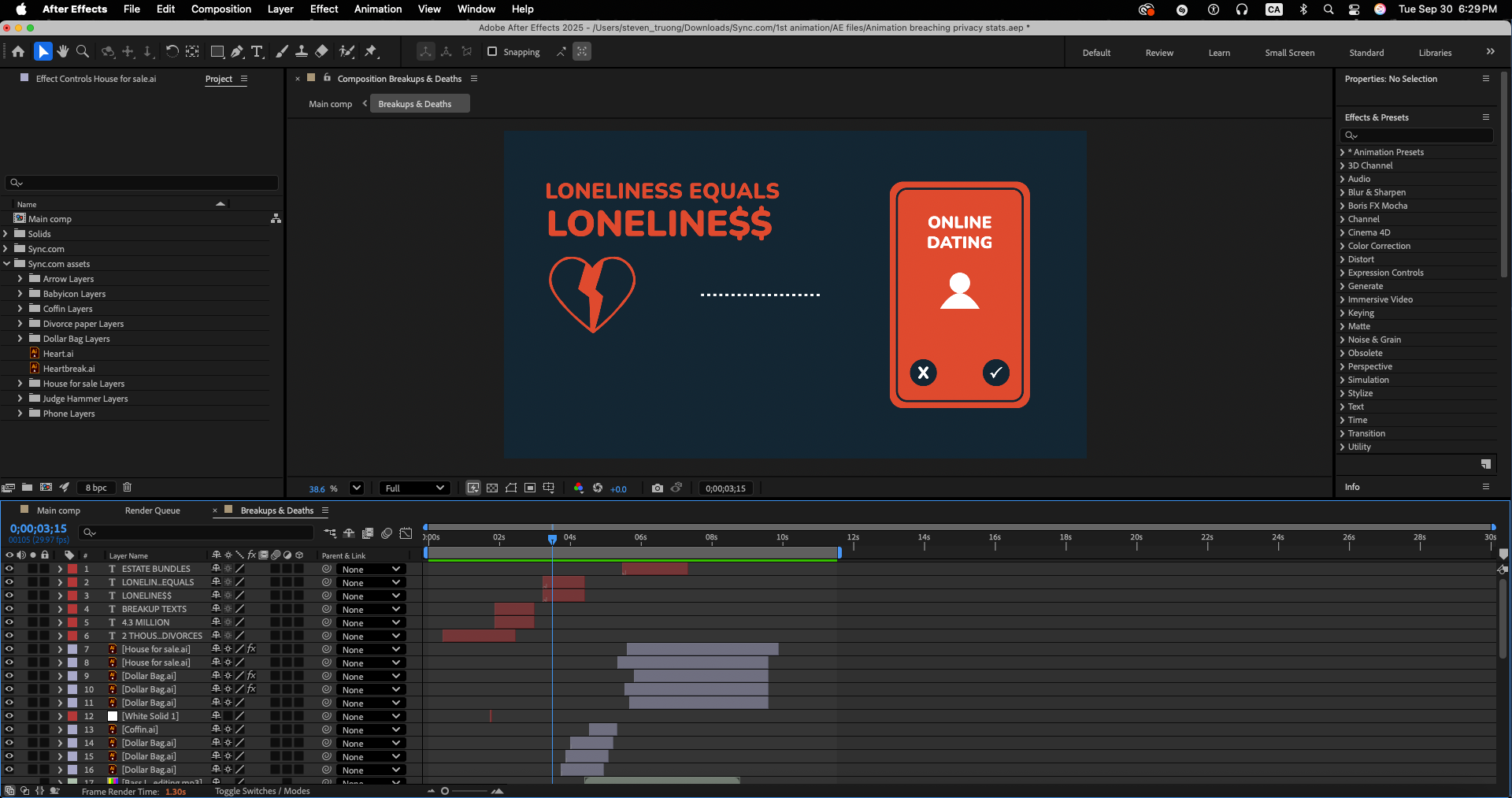
4. Animation Sequences
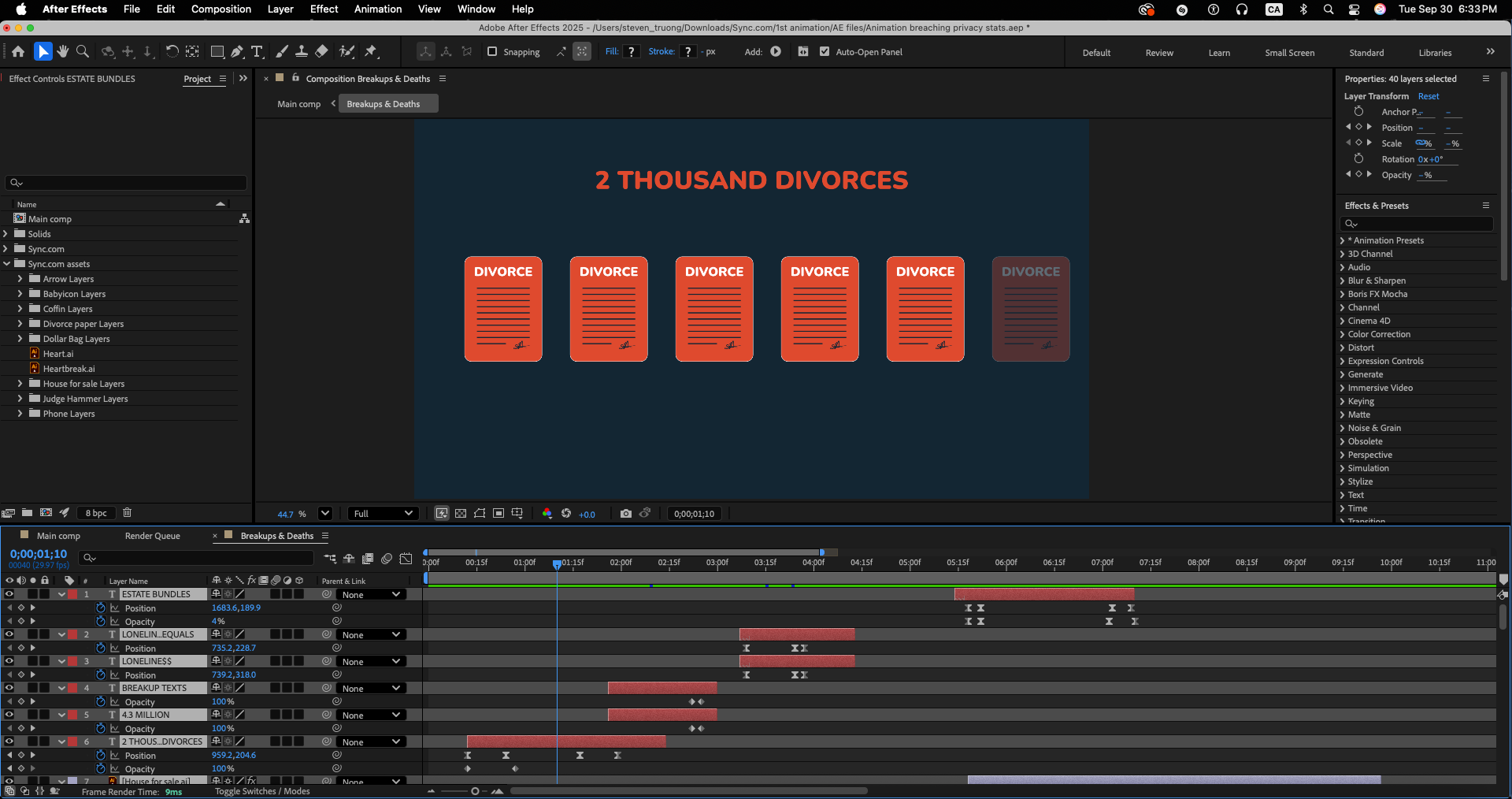
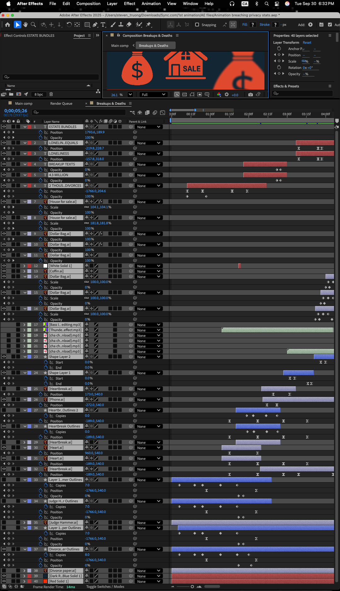
Using Adobe After Effects, I created animation sequences that translated abstract numbers into unsettling visuals:
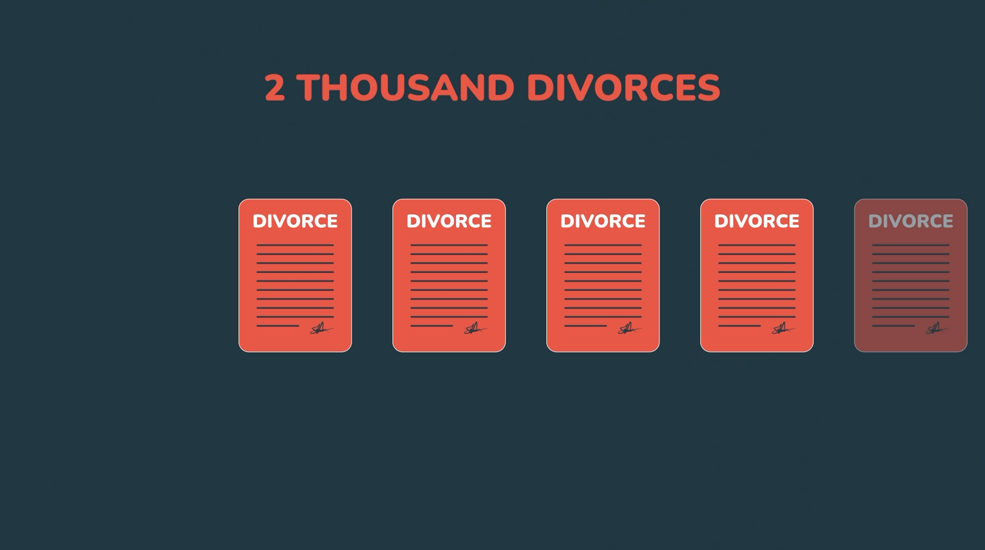
- Divorces → Premium Dating Leads
Animated splits and fractured lines symbolizing broken relationships repurposed for profit.
Animated splits and fractured lines symbolizing broken relationships repurposed for profit.
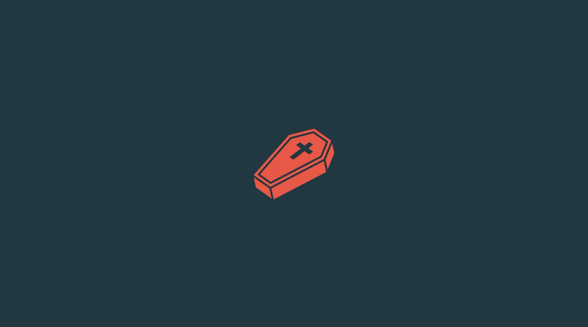
- Deaths → Estate Planning Bundles
Fading silhouettes and glitch effects suggesting loss turned into marketable products.
Fading silhouettes and glitch effects suggesting loss turned into marketable products.
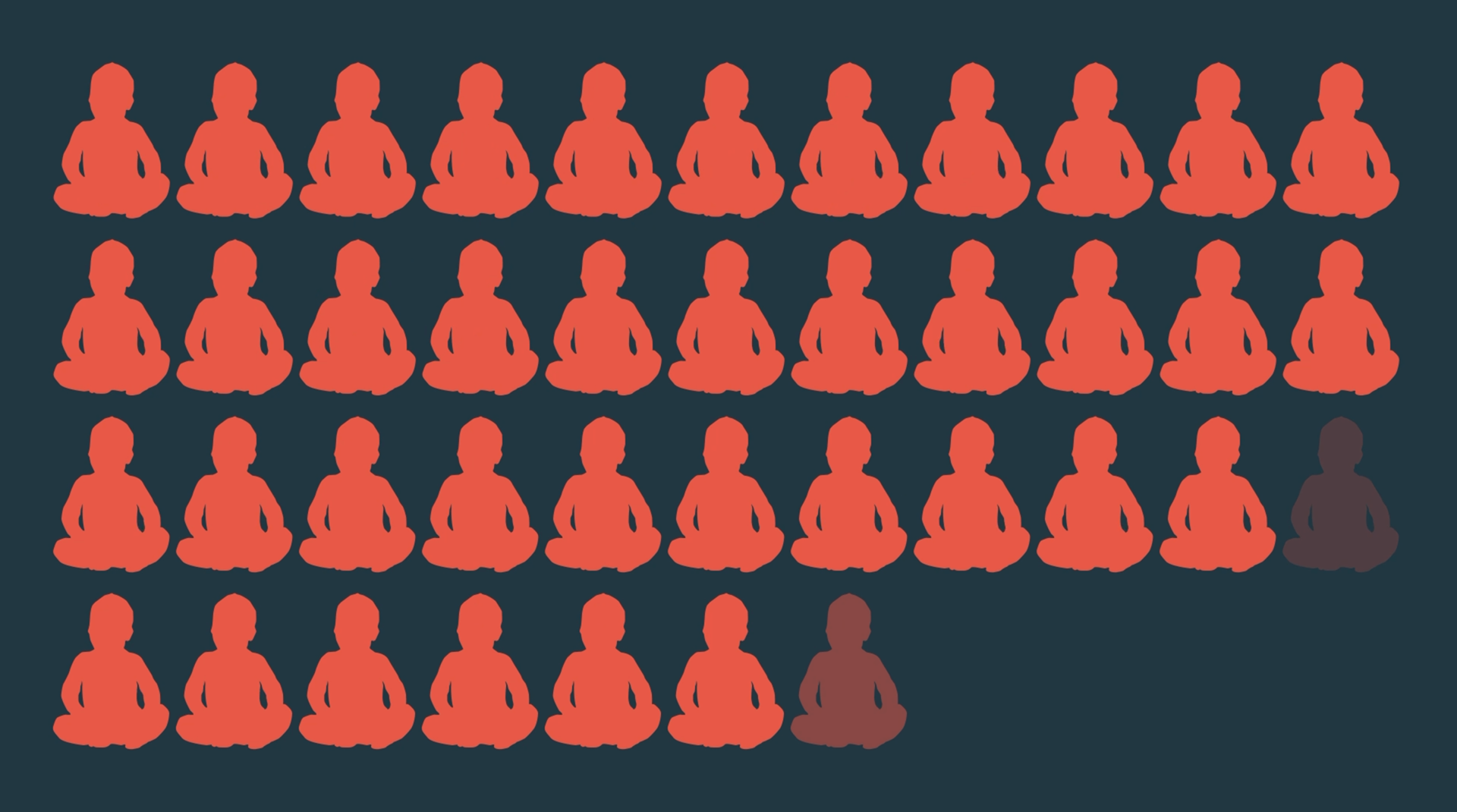
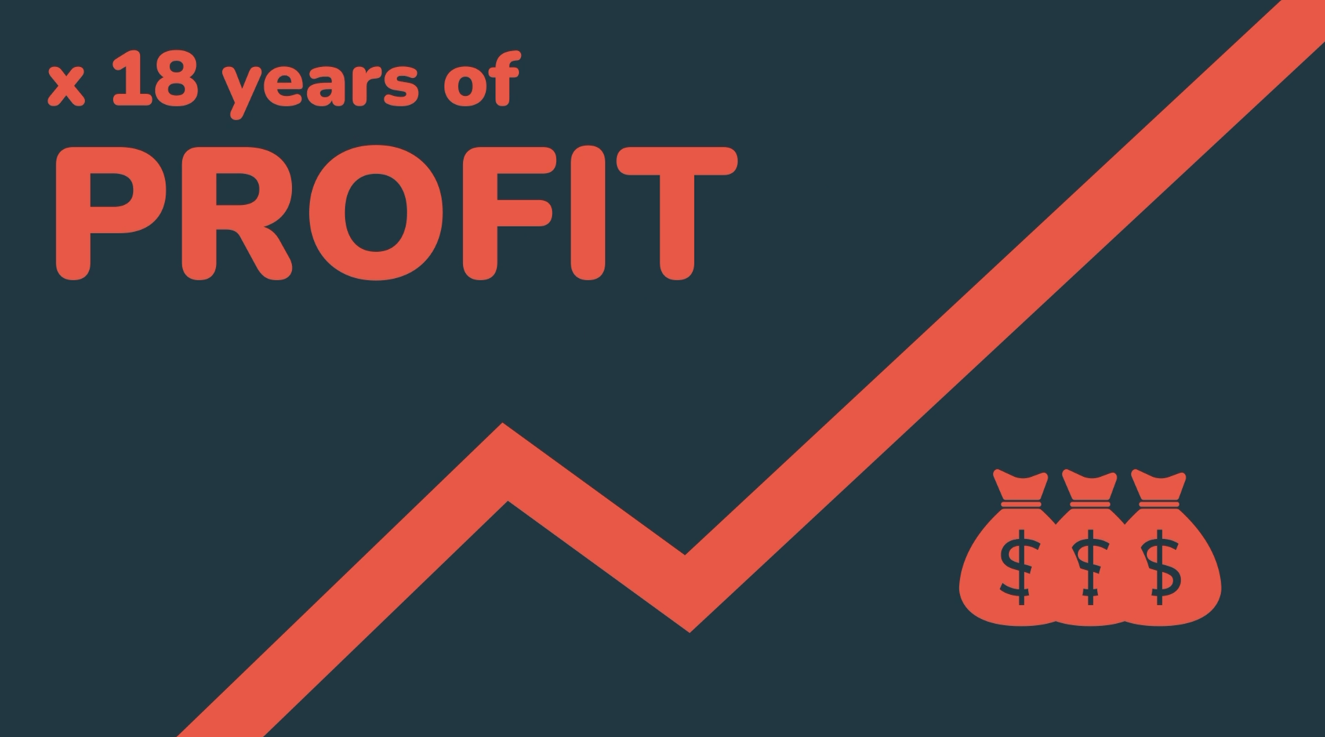
- Babies → 18-Year Sales Pipeline
A rhythmic counter system, highlighting how newborns are instantly commodified into decades-long marketing funnels.
A rhythmic counter system, highlighting how newborns are instantly commodified into decades-long marketing funnels.
Each sequence leaned into mechanical repetition and glitchy distortion, amplifying the dystopian message.
5. Colour Palette & Mood
The chosen palette combined Dark Royal Blue and Orange:
- Dark Royal Blue: Symbolizes authority, control, and the cold professionalism of the “evil agency.” It creates a corporate, almost government-like backdrop.
- Orange: Acts as the accent colour—representing urgency, exploitation, and warning signals. Against the blue, it cuts through like a danger light in a dark room.
- Together, the palette feels both trustworthy and intimidating: the blue anchors the corporate tone, while the orange injects energy and menace.
This combination ensured that the animations felt cinematic and unsettling, yet clean and professional enough to match Sync.com’s design system when adapted into their campaign.
6. Sound & Timing
Motion was synced to narration for maximum impact.
Pauses in narration matched with animation holds to emphasize statistics.
The “babies” sequence accelerated with rhythmic counters, echoing the overwhelming scale described in the script.
Subtle audio cues (SFX) such as thunder and digital clicks enhanced the dystopian tone.

Tools Used
- Adobe After Effects – Motion design and animation
- Adobe Illustrator – Icon and asset creation
- Adobe Premiere Pro – Video editing, sound syncing, and format conversion
Format Coversion
Horizontal → Vertical Conversion Process
The original was in horizontal format for presentations. Later, I was tasked with reworking it for vertical platforms (TikTok, Instagram Reels, YouTube Shorts).
Adapting the video for vertical platforms was more than just cropping — it required a rethink of the composition and pacing.
• Challenges:
- Important text and icons were cut off in vertical format.
- Animations felt too wide and lost impact on a tall screen.
- Social media demands quicker delivery of information.
• This required:
- Reframing animations to ensure impact on a vertical canvas.
- Adjusting hierarchy so text and icons remained legible on smaller screens.
- Re-timing pacing to fit the shorter attention span of social media viewers.
• Solutions:
- Reframed graphics so key visuals sat in the vertical “safe zone.”
- Increased font sizes and icon contrast for mobile readability.
- Re-timed animations to deliver stats faster, aligning with TikTok/Reels attention spans.
This conversion made the campaign versatile—capable of reaching both boardroom presentations and everyday social media feeds.
The adaptation to vertical format of the first sequence with changes made appropriately, without sound
This is the continuation of the animation's vertical adaptation for the second sequence, without sound
Bonus Section – Sync.com vs. Competitors
To further communicate Sync.com’s strengths, I produced a comparison video showcasing the uploading process difference:
- Competitors: Files upload unencrypted → icons and progress bar reveal data is instantly exposed and vulnerable.
- Sync.com: Files upload with end-to-end encryption → visualized as a secure lock animation with no third-party access.
This side-by-side comparison made Sync.com’s value proposition crystal clear: your files remain private from the moment you upload them.
Reflection
This project was a unique challenge: blending satirical storytelling, motion graphics, and format adaptation into one campaign. My contributions helped transform a script into an engaging, thought-provoking visual narrative that emphasized Sync.com’s mission—privacy by default.
Thanks for watching, and stay tuned for more!